Usage
The dfviz interface is designed to be simple and easy to use.
Invoking dfviz
The main entry point is dfviz.DFViz. Pass either a Pandas or Dask dataframe, and optionally
pass values for any of the widget in interface. The following sets the plot type to “bar”
and that the “y” values should be taken from (the only) column “data”:
import pandas as pd
import dfviz

df = pd.DataFrame({'data': [5, 2, 6]})
dfv = dfviz.DFViz(df, kind="bar", y=["data"])
To show the interface, you can simply render dfv.panel in a notebook cell (by letting it
be the last thing in the cell), using display() on dfv.panel, or running dfv.show(),
which will launch the interface stand-alone in a new browser tab.
Walkthrough
Ee will demonstrate the options available in the interface by using example random data. To view the example, please execute
import dfviz
dfviz,example.run_example()
and you should see the following in a browser tab
The interface has three main components:
above the grey area are the two main controls to select the type of plot, and to render the plot
the central grey area, which dominates the space, is for user input. Here you can define the sampling of the data, the columns to use, and style attributes of the plot
below, and currently blank, is hte output area, which will contain the plot and a text description of how to produce this plot from the data.
Clicking Plot
The “Plot” button causes a rendering of the data with the current selections. If you change parameters in the input area, the plot will not update until you press this button. Try it now. The two panes of the output area will contain the graph:
and the parameters that were used to produce it
Note that the example sets the parameters to produce decent output.
Setting Parameters
Each pane contains different controls which affect the plot you will see:
“Plot Type”
Several types of output are available, provided by hvPlot. Please follow the link to see the kinds of output you can expect, and the effect that setting parameters can have on them.
“Control”
These are global parameters, particularly the sampling of the underlying data.
For example, choosing to sample (checking the box next to “Sample”) and picking the “Head” method with 100 rows will select only the first 1/10th of the data and will produce output something like
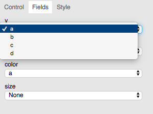
“Fields”
Here we can define which column of the input data is used for what function while plotting.
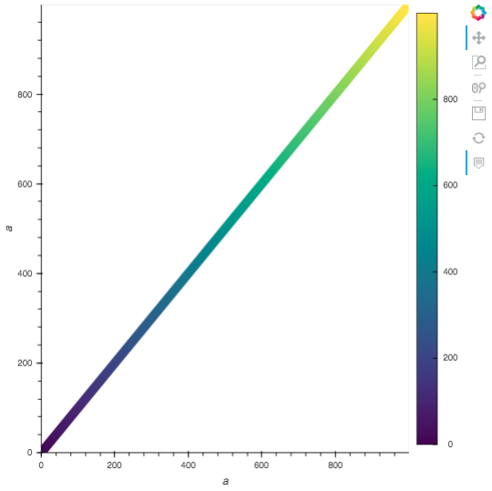
The example data-frame contains columns “a”, “b”, “c” and “d”. So for example, if we select
columns “a” (a monotonically increasing integer) for the y axis
we get output
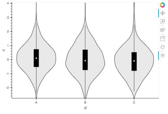
Which field functions can be selected here will depend on the plot type; for example, the table plot type only allows selection of which columns to show, but statistical plots like violin allow grouping in this case “by” categorical column “d”:
It is possible to pick combinations of fields which do not produce any reasonable output. Again, please refer to hvPlot.
“Style”
This pane offers optional parameters which affect the general look of the plot, such as colours, marker styles and axes extent. Some of these are also only shown for those plot types where they are appropriate; and some will not have any effect for all combinations of fields selections (a legend is not shown when only one column is selected, even if the a legend is requested).